- Company Articles
- Products and Technology
- Product knowledge
- Aluminum Honeycomb Panel Color Options: Aesthetic & Functional Choices for Workspaces

Aluminum Honeycomb Panel Color Options: Aesthetic & Functional Choices for Workspaces
Related Product
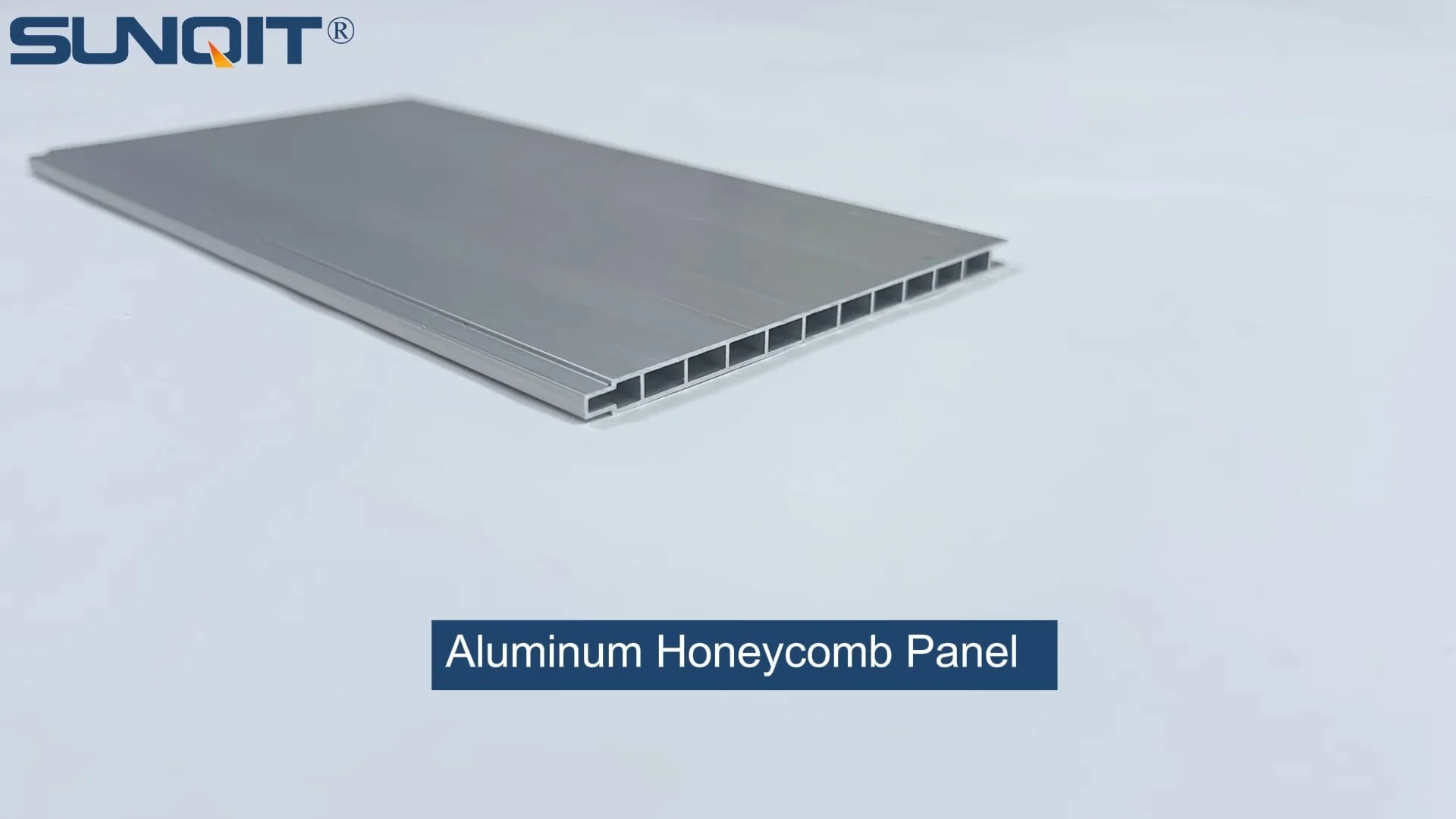
Aluminum Honeycomb Panel
Aluminum honeycomb panel used as table top, side wall, it is connected one pcs by one pcs from the side slot to make a full pieces.This panel width 105mm, 55mm, 35mm are optional for slection.
How the right shade can transform your workspace from merely functional to genuinely inspiring—without sacrificing efficiency.
Why Aluminum Honeycomb Panels Are Redefining Workspace Design
Walk into any modern office, manufacturing floor, or lab today, and you'll likely spot a common thread: sleek, durable surfaces that balance form and function. More often than not, those surfaces are aluminum honeycomb panels. Lightweight yet surprisingly strong, these panels have become a staple in workspace design, thanks to their ability to withstand heavy use while keeping spaces feeling open and uncluttered. But here's the thing—we rarely talk about their color . Most people assume panels are just "there," blending into the background. But the truth? The shade of your aluminum honeycomb panel can be the difference between a workspace that feels drab and draining, and one that energizes your team, streamlines workflows, and even reinforces your brand.
Let's start with the basics: aluminum honeycomb panels are constructed from two thin aluminum skins bonded to a honeycomb-shaped core (usually made of aluminum or paper). This design gives them an impressive strength-to-weight ratio—they're tough enough for workbench tops in busy factories but light enough to install without bulky supports. And because they're made from aluminum, they're resistant to scratches, stains, and corrosion, making them ideal for high-traffic areas. But what really sets them apart is their versatility, especially when it comes to color. Unlike traditional wood or plastic panels, aluminum honeycomb panels can be coated in almost any hue, from soft neutrals to bold, eye-catching shades. And each color brings more than just aesthetics to the table—it can enhance functionality, too.
Color Isn't Just About Looks—It's About How We Work
Think about the last time you walked into a room painted bright red. Chances are, your heart rate picked up a little, or you felt a surge of energy. Now imagine a room painted soft blue—calmer, right? Color psychology isn't just a marketing buzzword; it's a real, measurable phenomenon that affects our mood, focus, and even productivity. In a workspace, where people spend 8+ hours a day, this matters. A poorly chosen color can make employees feel sluggish or anxious, while the right one can boost concentration, reduce stress, and even encourage collaboration.
But color in workspaces isn't just about feelings—it's about function, too. For example, in a manufacturing setting, a bright yellow panel might be used to mark safety zones or highlight tools, making them easier to spot at a glance. In a lab, a dark gray panel could hide stains from chemicals, ensuring surfaces always look clean and professional. And in an office, a warm wood-grain finish might make a meeting room feel more inviting, encouraging creative brainstorming. When you pair these functional benefits with the durability of aluminum honeycomb panels, you're not just choosing a color—you're designing a workspace that works with your team, not against them.

The Basics: How Aluminum Honeycomb Panels Get Their Color
Before we dive into specific colors, let's quickly cover how these panels are colored. Most aluminum honeycomb panels are finished using a process called powder coating. This involves applying a dry powder (made of resin, pigment, and additives) to the aluminum surface, then curing it in an oven. The result? A hard, even finish that's resistant to chipping, fading, and scratches—perfect for busy workspaces. Powder coating also offers endless color options, from solid tones to metallic finishes, and even textured or matte looks. Some manufacturers also offer anodizing, a process that creates a protective oxide layer on the aluminum, which can be dyed in various shades. Anodized finishes tend to be more durable and fade-resistant than powder coating, making them a great choice for panels exposed to direct sunlight or harsh chemicals.
Another factor to consider is the panel's edge and frame. Many aluminum honeycomb panels are paired with aluminum extrusion profile —custom-shaped aluminum pieces that reinforce the edges or serve as mounting brackets. These profiles can be colored to match or contrast with the panel, adding another layer of design flexibility. For example, a white panel with a silver aluminum extrusion profile might create a clean, modern look, while a black panel with a yellow profile could draw attention to specific areas (like a lean system workstation where efficiency is key).

Aesthetic Color Choices: From Calm to Bold
Let's start with the fun part: picking colors that make your workspace look and feel the way you want. Neutral tones are always a safe bet, but don't sleep on bolder shades—when used strategically, they can inject personality without overwhelming the space.
Neutrals: The Unsung Heroes of Versatility
White, gray, and black are the workhorses of workspace design, and for good reason. They're timeless, easy to pair with other colors, and they make spaces feel larger and brighter. White panels, for example, reflect light, which is a game-changer in windowless areas or basements. They also create a clean, clinical look—ideal for labs, hospitals, or tech offices where precision is key. Light gray is slightly warmer than white, with a softness that reduces eye strain during long workdays. It hides minor dust and fingerprints better than white, making it a practical choice for workbench tops in garages or repair shops. Dark gray, on the other hand, feels sophisticated and modern. It's a popular choice for executive offices or creative studios, where it can serve as a backdrop for colorful decor or brand elements.
Bold Colors: Energize and Inspire
Why blend in when you can stand out? Bold colors like blue, green, and yellow can transform a dull workspace into a hub of energy. Blue is a crowd favorite for a reason: studies show it reduces stress and boosts focus, making it perfect for offices or call centers where concentration is critical. A soft sky blue panel might calm a busy customer service team, while a deeper navy could add a touch of professionalism to a meeting room. Green, often associated with nature, is another winner. It's been shown to reduce eye strain (great for teams staring at screens all day) and promote creativity. A light sage green panel in a brainstorming area could encourage out-of-the-box thinking, while a vibrant emerald might add a pop of color to a otherwise neutral manufacturing floor.
Yellow is the wildcard here. Bright and cheerful, it's known to energize and stimulate mental activity—but use it sparingly. A little yellow goes a long way; too much can feel overwhelming. Try using it as an accent: a yellow panel on a single workbench in a production line, or as a border around a white panel in a break room. It's also great for safety zones—think: "this is where the tools go" or "watch your step here."
Wood Grain and Metallics: Warmth Meets Modernity
If you want the best of both worlds—natural warmth and industrial durability—wood grain or metallic finishes might be the way to go. Wood grain aluminum panels mimic the look of oak, maple, or walnut, adding a touch of coziness to otherwise sterile spaces. They're perfect for offices that want to feel welcoming (like a startup aiming for a "homey" vibe) or reception areas where first impressions matter. Metallic finishes (silver, gold, bronze) add a touch of luxury. Silver is sleek and modern, pairing well with white or black panels for a high-tech look. Gold or bronze, while less common, can add elegance to executive spaces or brand-focused areas (think: a company logo displayed on a bronze panel).
Functional Color Considerations: When Shade Impacts Performance
Now, let's talk about the less glamorous but equally important side of color: how it affects how well your workspace works . A pretty color won't do you much good if it fades in sunlight, shows every scratch, or makes it hard to spot tools. Here's what to keep in mind:
Stain and Scratch Resistance
Light colors (white, cream, light gray) show dust, fingerprints, and stains more easily than dark colors. If your workspace involves messy tasks—like painting, soldering, or handling oils—dark gray or black panels might be a better choice. They hide imperfections, meaning you'll spend less time cleaning and more time working. On the flip side, if your team works with small parts (like electronics), light panels can make it easier to spot dropped screws or components—no more squinting to find that tiny resistor on a dark surface.
ESD Protection (Because Static Kills Electronics)
In tech manufacturing or labs where electrostatic discharge (ESD) is a risk, color isn't just about looks—it's about safety. ESD-safe panels are coated with materials that dissipate static electricity, preventing damage to sensitive components. These coatings often come in dark colors like gray or black, which not only hide dust but also work well with the conductive additives in the coating. So if you're setting up an ESD workbench , you might want to opt for a dark gray panel—it's functional and practical.
Visibility and Safety
In manufacturing or warehouse settings, color can be a lifesaver—literally. Bright colors like yellow, orange, or red are used to mark hazards, tool storage areas, or workflow paths. For example, a yellow aluminum honeycomb panel along the edge of a conveyor belt could warn workers to keep their hands clear. A red panel near emergency stops might draw attention to critical safety equipment. Even in offices, color can improve visibility: a light green panel on a desk might make it easier to find documents (since green contrasts well with white paper), reducing eye strain.
Heat Reflection
Light colors reflect sunlight, while dark colors absorb it. If your workspace has large windows or is exposed to direct sunlight, light-colored panels (white, light gray) can help keep the area cooler, reducing the load on your AC. Dark panels, on the other hand, might be better in cold climates—they absorb heat, which can help warm up a drafty workshop. It's a small detail, but it can add up to big energy savings over time.
Popular Aluminum Honeycomb Panel Colors: A Breakdown
To help you narrow down your choices, here's a closer look at some of the most popular aluminum honeycomb panel colors, along with their aesthetic and functional perks:
| Color | Aesthetic Trait | Functional Benefit | Ideal Workspace |
|---|---|---|---|
| White | Bright, clean, spacious | Reflects light; makes small spaces feel larger | Labs, offices, tech workstations |
| Light Gray | Soft, neutral, modern | Hides minor dust; reduces eye strain | General workbench areas, repair shops |
| Dark Gray | Sophisticated, bold, high-contrast | Conceals stains; ESD-friendly | Electronics manufacturing, executive offices |
| Blue (Light) | Calm, serene, trustworthy | Reduces stress; boosts focus | Call centers, offices, creative studios |
| Green (Sage) | Natural, calming, refreshing | Reduces eye strain; promotes creativity | Design labs, brainstorming areas |
| Yellow | Energetic, attention-grabbing | High visibility; marks safety zones | Manufacturing floors, tool storage areas |
| Wood Grain | Warm, inviting, homey | Adds texture; hides minor scratches | Reception areas, startup offices |
| Metallic Silver | Sleek, modern, high-tech | Reflective; pairs well with other colors | Tech labs, lean system workstations |
Matching Color to Your Workspace: A Practical Guide
Still unsure which color to choose? Start by asking yourself a few key questions:
What Does Your Team Do All Day?
If your team spends hours staring at screens (like software developers or designers), opt for soft, calming colors (light blue, sage green) to reduce eye strain. If they're on their feet moving heavy equipment (like warehouse workers), high-visibility colors (yellow, orange) can improve safety. For teams that need to focus intensely (like researchers or accountants), neutrals (white, light gray) might be best—they're less distracting.
What's Your Brand Vibe?
Your workspace should reflect your brand. A creative agency might lean into bold colors (red, purple) to show off their personality, while a law firm might stick to classic neutrals (navy, gray) to convey professionalism. If your brand has specific colors, incorporate them! For example, a company with a blue logo could use blue aluminum honeycomb panels in their reception area to reinforce brand recognition.
What's the Lighting Like?
Natural light changes how colors look—sunlight can make yellows appear brighter and blues appear cooler. Artificial light (fluorescent, LED) can also affect tones. Test color samples in your actual workspace before committing. A panel that looks great in a sunny showroom might look washed out under fluorescent lights in your office.
How Does It Fit Into Your Lean System ?
If you're using a lean system (a workflow philosophy focused on reducing waste and improving efficiency), color can help streamline processes. For example, use different colors to mark work zones: green for "in-progress" tasks, red for "needs attention," and blue for "completed." This visual cue makes it easier for teams to stay organized and spot bottlenecks.
Customization: When Off-the-Shelf Colors Aren't Enough
Sometimes, you need a color that's uniquely yours. Maybe you want to match your brand's exact Pantone shade, or you need a custom mix to fit a specific theme. The good news? Many manufacturers offer custom color options for aluminum honeycomb panels. This is where aluminum profile accessories come into play, too. For example, you could order panels in your brand's signature blue, then pair them with matching aluminum extrusion profile brackets or edge trims. Some manufacturers even offer textured finishes (like matte or gloss) to add another layer of customization. Just keep in mind: custom colors may cost more and have longer lead times than standard shades. But if getting the perfect hue is worth it for your team's morale or brand identity, it's often a smart investment.
Conclusion: Color as a Tool for Better Work
At the end of the day, aluminum honeycomb panels are more than just surfaces—they're a canvas for your workspace's personality and performance. Choosing the right color isn't about picking the "prettiest" shade; it's about finding the one that aligns with how your team works, what your brand stands for, and the practical needs of your space. Whether you opt for a soft white to brighten a lab, a bold yellow to mark safety zones, or a wood grain finish to warm up your office, remember: color is a tool. Use it to inspire, to streamline, and to make your workspace feel like a place where great work happens.
So the next time you're upgrading your workbench , revamping a production line, or designing a new office, don't overlook the power of a well-chosen shade. Your team (and your productivity) will thank you.